_by the people.

Logo
Shape Kori Akedo

Kori Akedo came to us as an idea: a Japanese arcade built on the nostalgia of 80s and 90s gaming culture. We built it from the name up, developing the strategy and the full visual identity alongside it. The idea underneath it is what makes it work. Kori shares a lobby with Hono, and the two brands are opposites by design, ice and flame, two sides of the same coin.

Kori Akedo
Project Kori Akedo
Description A Japanese arcade built on 80s and 90s gaming nostalgia. Ice to Hono's flame, sharing one lobby.
Industry Hospitality & Entertainment
Scope Naming, Brand Strategy, Identity, Brand World
Shape THE FRICTION

Kori had to feel genuine and stand apart from what already existed, while working for both kids and adults, sitting right next to Honō, a brand that was already fully formed.

Shape THE INSIGHT

Nostalgia for 90s and 2000s gaming belongs to the adults who grew up on it as much as the kids playing today. Placed beside Honō, it also gave Kori a way to define itself: the opposite of fire.

Shape THE IDEA

Two sides of the same coin. We built Kori around ice against flame, carrying the contrast between the two brands into everything from the name to the identity.

Gallery
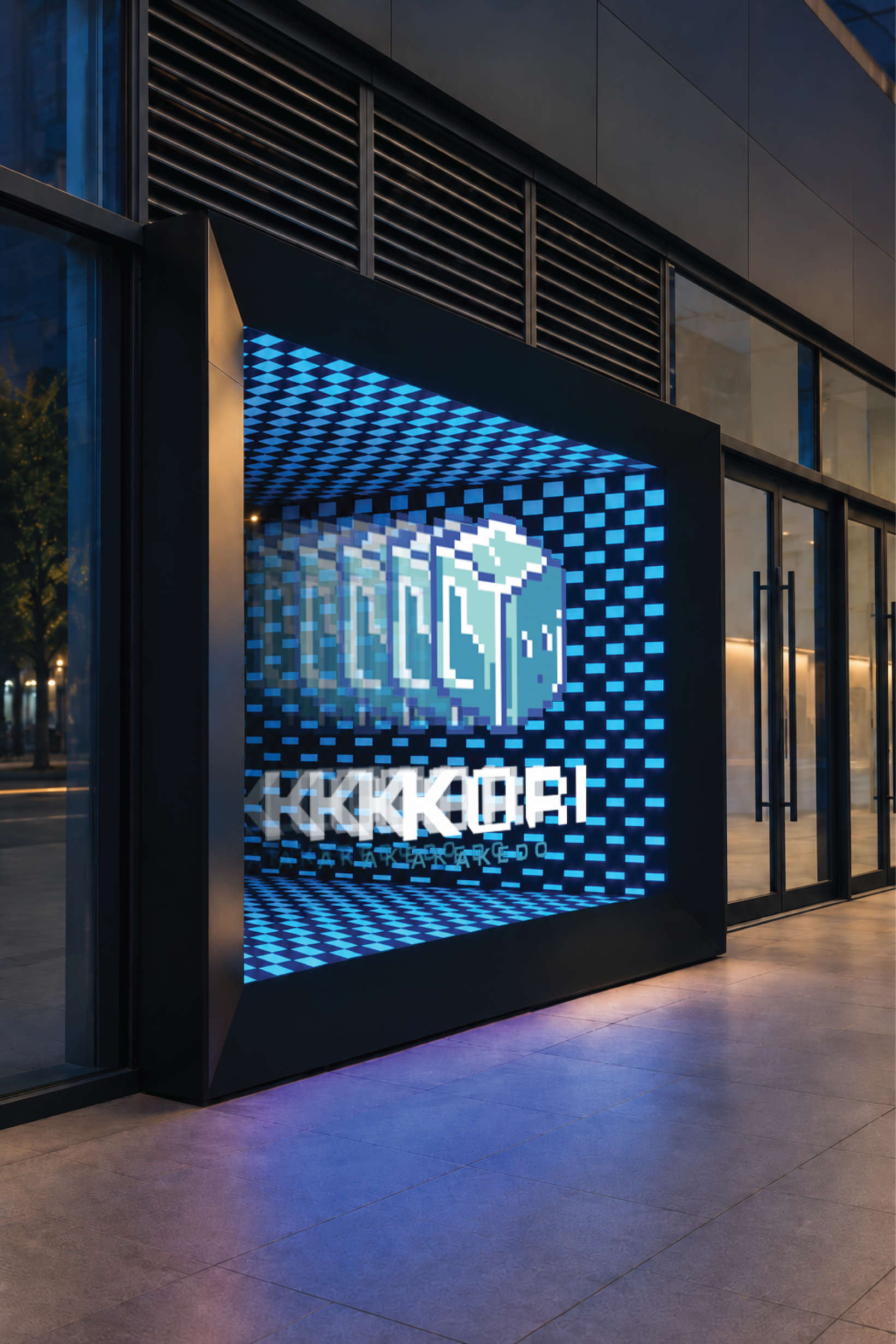
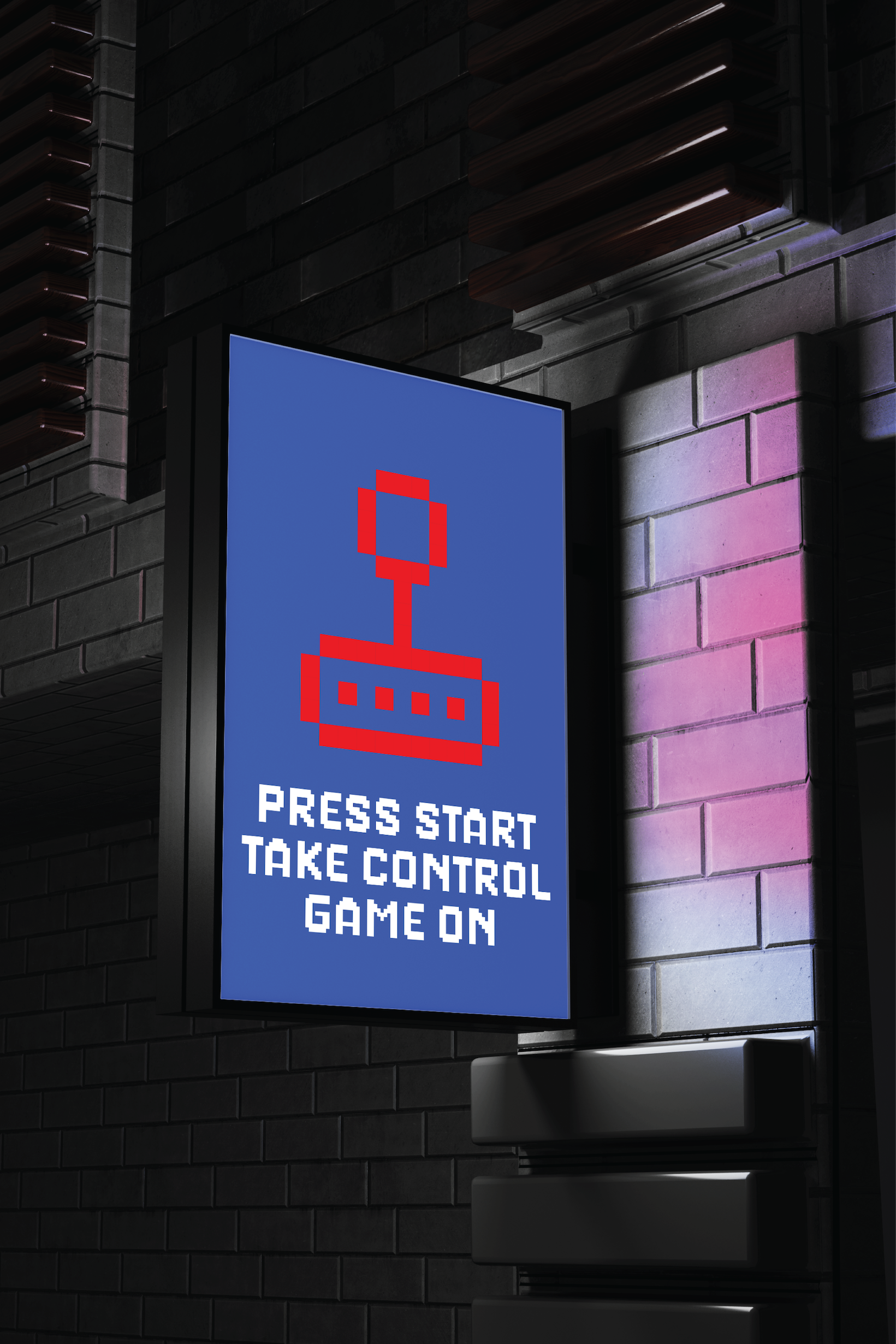
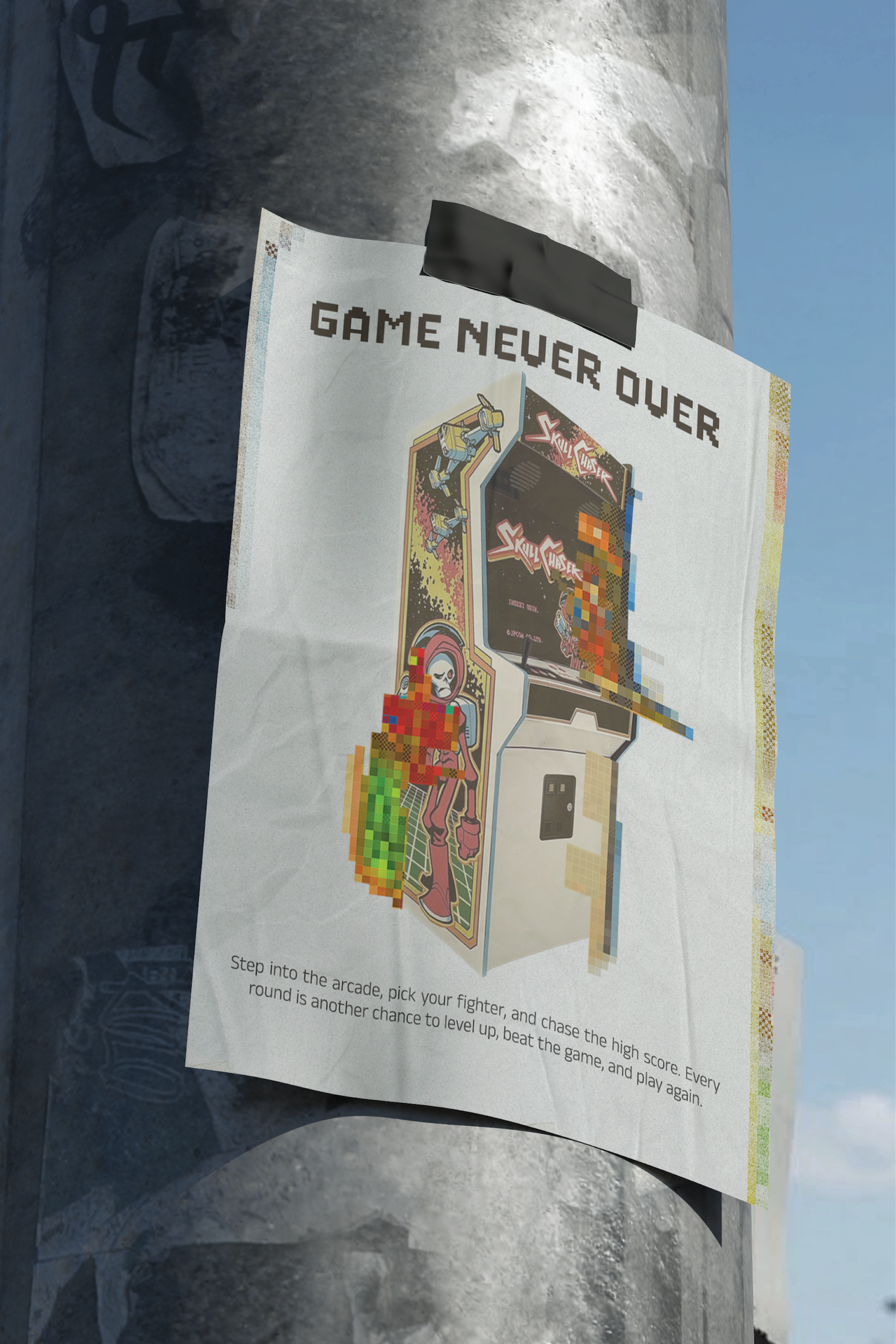
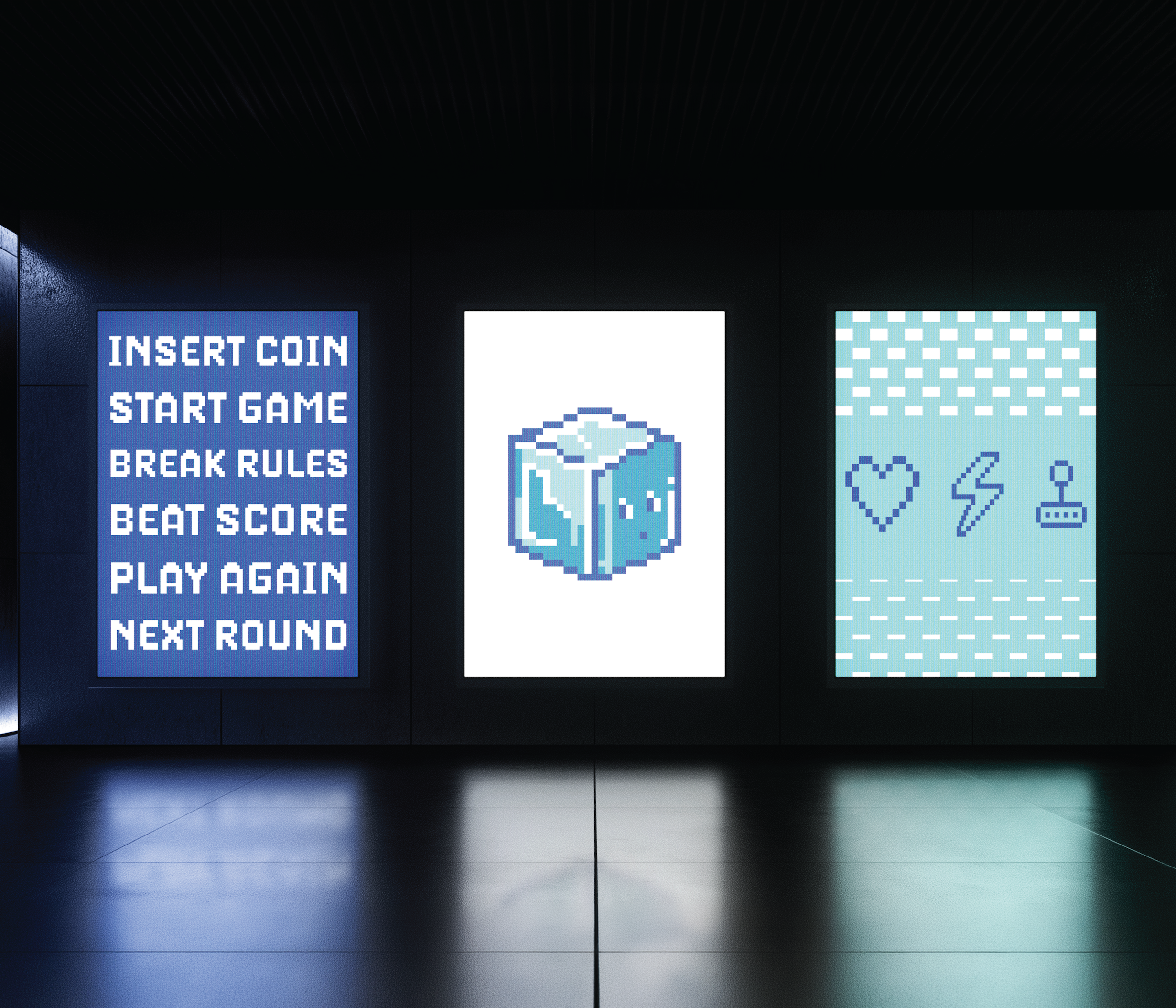
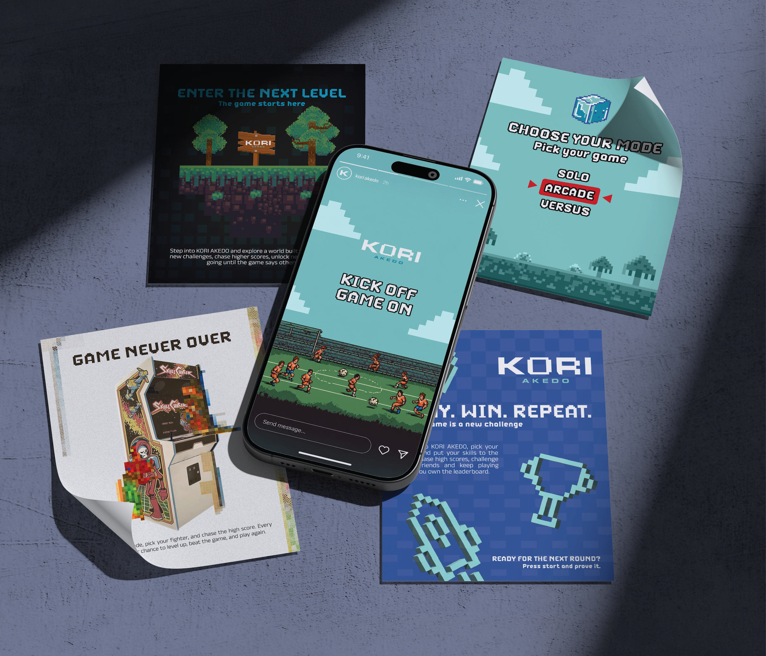
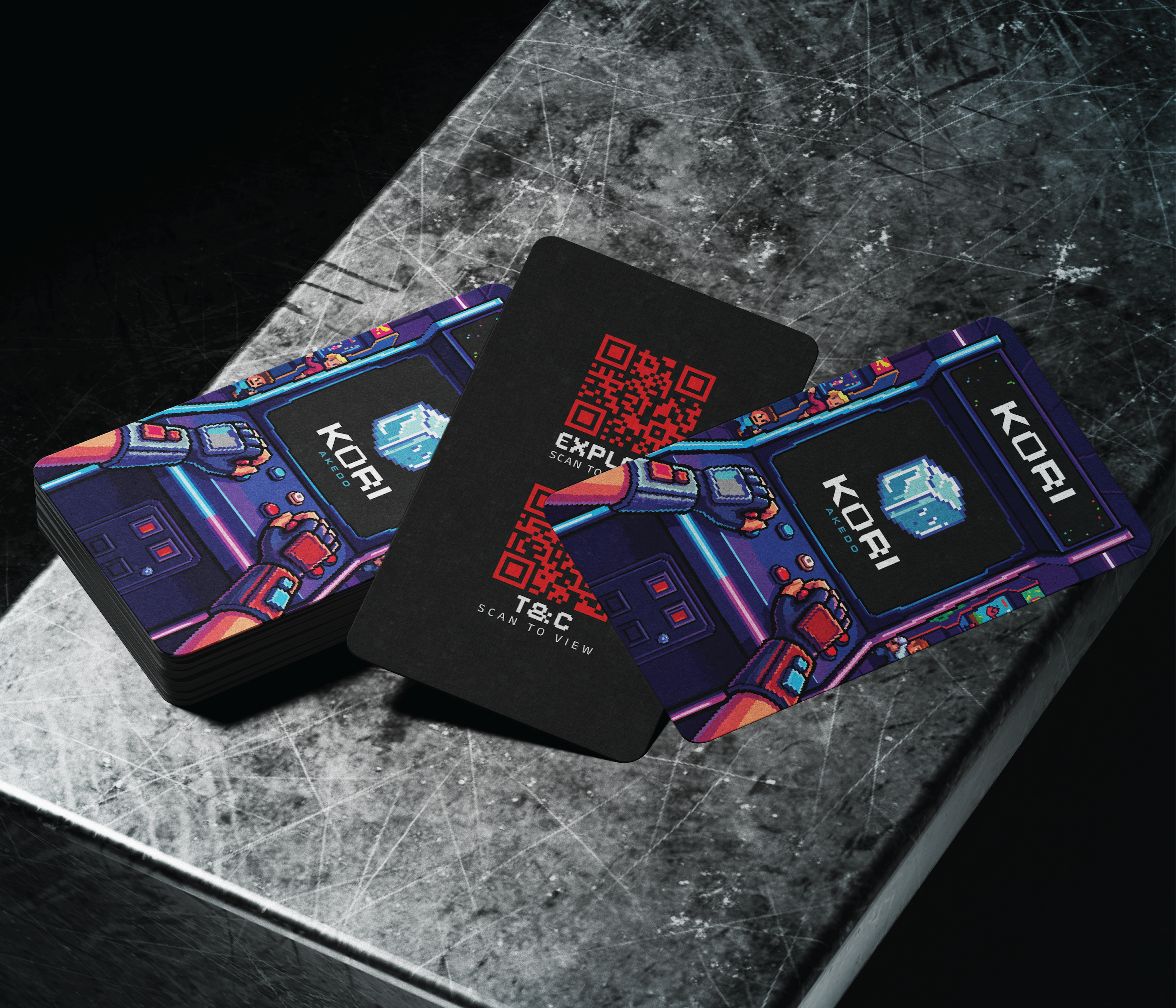
Kori Akedo, storefront LED wallKori Akedo, street lightbox signageKori Akedo, street posterKori Akedo, interior neon sign wallKori Akedo, interior lightbox panelsKori Akedo, print collateralKori Akedo, membership cards
Kori Akedo